Now that decisions have been made about the look of some things, now we're looking at how the buttons go and in which order.
This is not an interactive experience
This exists to make aesthetic choices
I feel like I have to keep putting that up until I have something that's actually interactive.
Some significant time after I made the initial mockups, I realised that I needed way more buttons than I initially created in the BS version. So. Version 1 (immediately below) has the buttons initially described in the BS version.
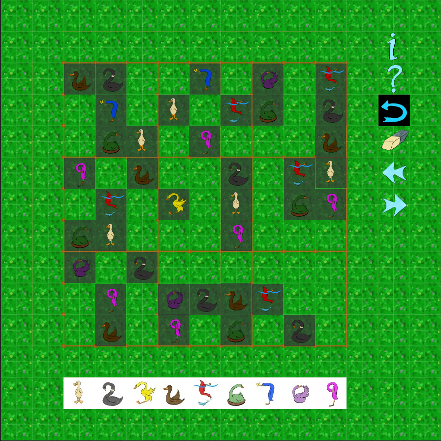 Shown here: A mockup of a game in the starting state, cribbed from an actual game of Sudoku. The bird buttons are on the bottom and the game interaction buttons are on the right hand side.
From top to bottom, the buttons on THE RIGHT are:
- Guide
- Help
- Undo [not available because the player has not made any moves]
- Erase
- Previous
- Next
Now for Version 2 (immediately below) which features all the game interaction buttons in an order which I believe makes rational sense.
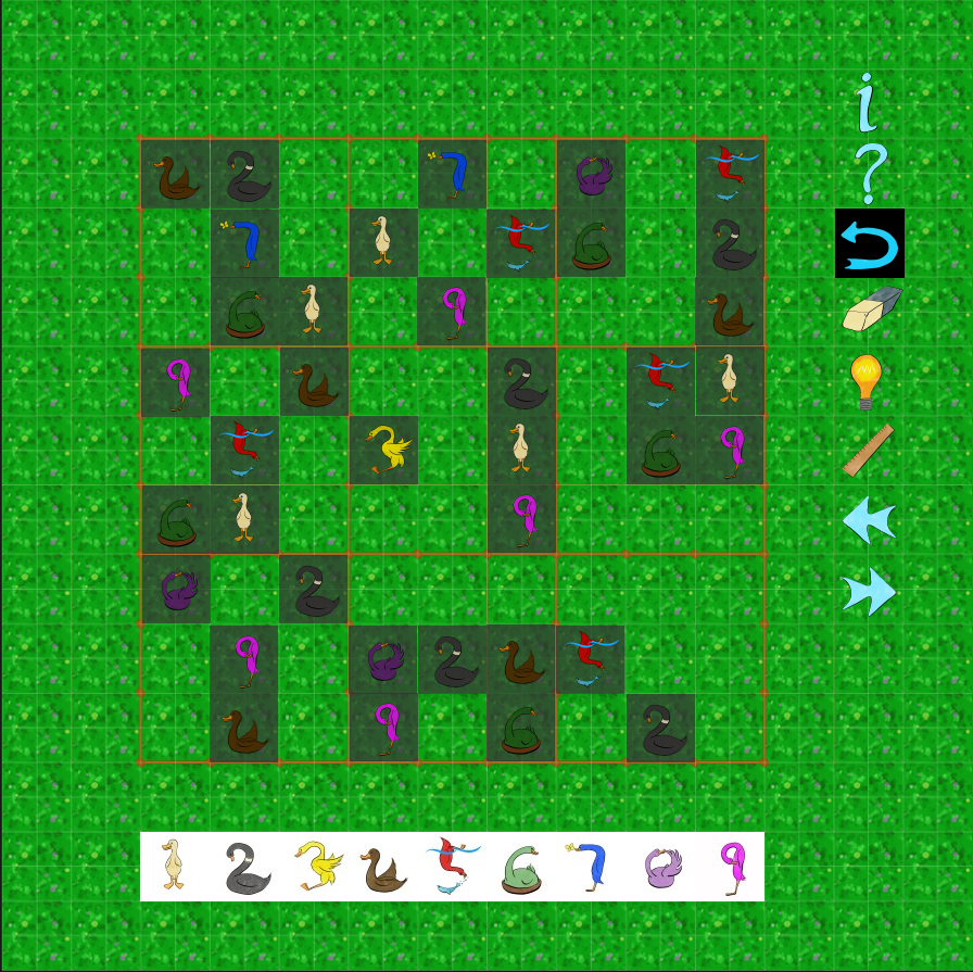 Shown here: A mockup of the same game as above, with more buttons on the right hand side.
From top to bottom, the buttons on THE RIGHT are:
- Guide
- Help
- Undo [not available because the player has not made any moves]
- Erase
- Hint
- Show "sight" lines or Show "forbidden" lines
- Previous
- Next
The Questions
- Which version (the number of buttons) do you prefer?
- Is there an order of buttons that you think would be better?