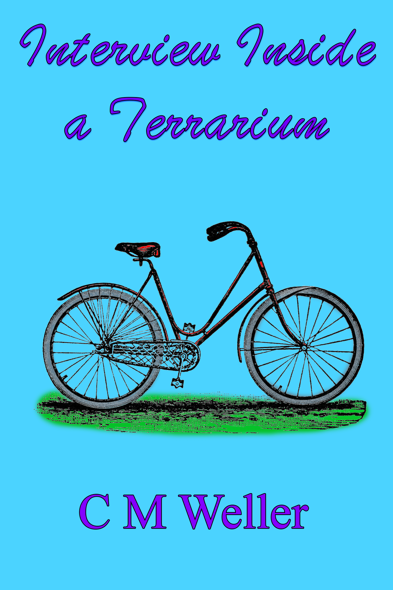
I can’t art. It’s obvious.
Alas, I also lack the resources to purchase pro-level art for a book that will never pay me back.
My usual design consultant [aka best-beloved SO] is too busy to help me before the October 4 publication date.
So. Speaking as someone who lacks design skills to everyone who actually has them: What do I need to do to make this cover look cool?
My goal is simple, but slightly “off”. Like a Penguin Classics cover from an alternate dimension. You remember how they had the title and some old etching art with a crappy colourisation job on the cover? Something like that, with a hint of eldritch.
That’s why I put the shadow effects on the title, to make it look like it was about to float away from the cover.
As always, I insist that my name is in a smaller font size than the title.
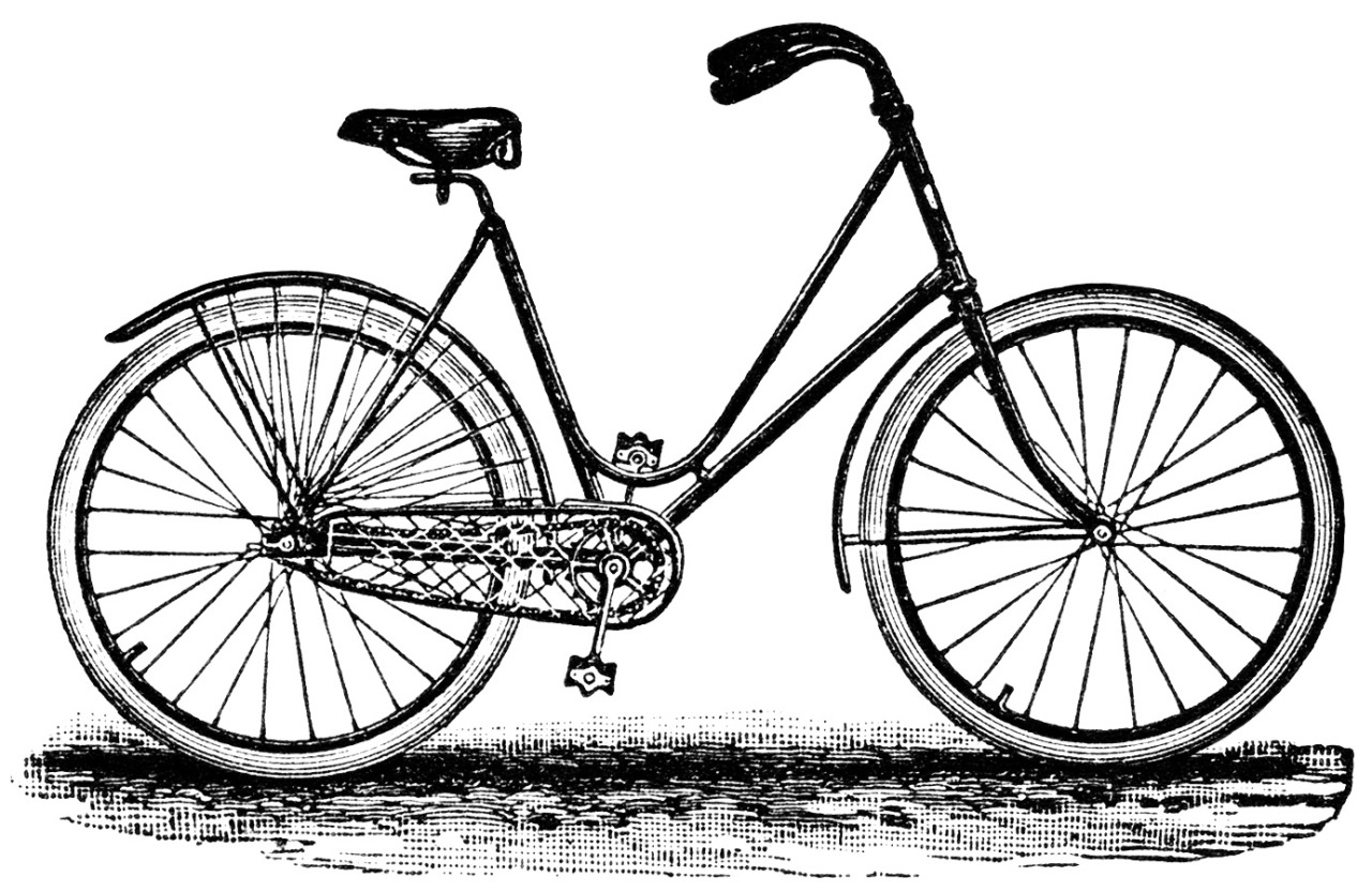
Hints and tips appreciated, peeps. Just remember I have limited Photoshop skills [I moebius’d the front wheel of the bike myself :D It took me five hours and fifteen goes.] so if you’re going to get technical, break it down to the For Dummies version :)
I wanted a title font that looked slightly unhinged. Better suggestions also appreciated. Thanks in advance for all your help.
What would you do to make this look cooler?
Rebaggling in the hope of some feedback on this thing.