Is this better?
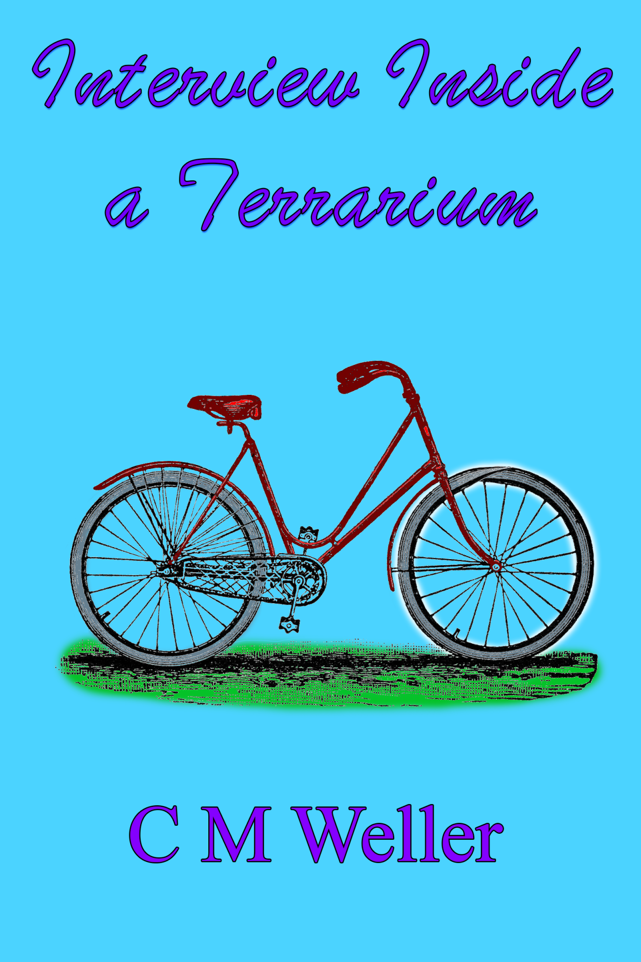
I got rid of the ugly, under-colouring ‘glow’ and refined it to an effects layer [harder than it looks, I had to re-fill the wheel and delete all the noise from my previous attempts] which I can now edit to my heart’s content.
I also added some blood red to the body of the bicycle and fooled with the opacity a little. Too strong == uglier :P
I mean, I want it to look like an ugly colourisation job, but not THAT ugly.
I’m still not happy with the firkin title font though.
What do you think?