Warning!
This page is image heavy and might strain your bandwidth. Each image is the size I drew it at, but they've been resized for the actual game. I drew all images using ProCreate on an elderly iPad Pro, with some adjustments in GIMP.
Set 1: The Background
The idea of getting a player comfortable with Sudoku and Pseuducku is to envision placing the ducks in a "pen" so that they're "happy". Thus, the background loosely resembles a flowery meadow.
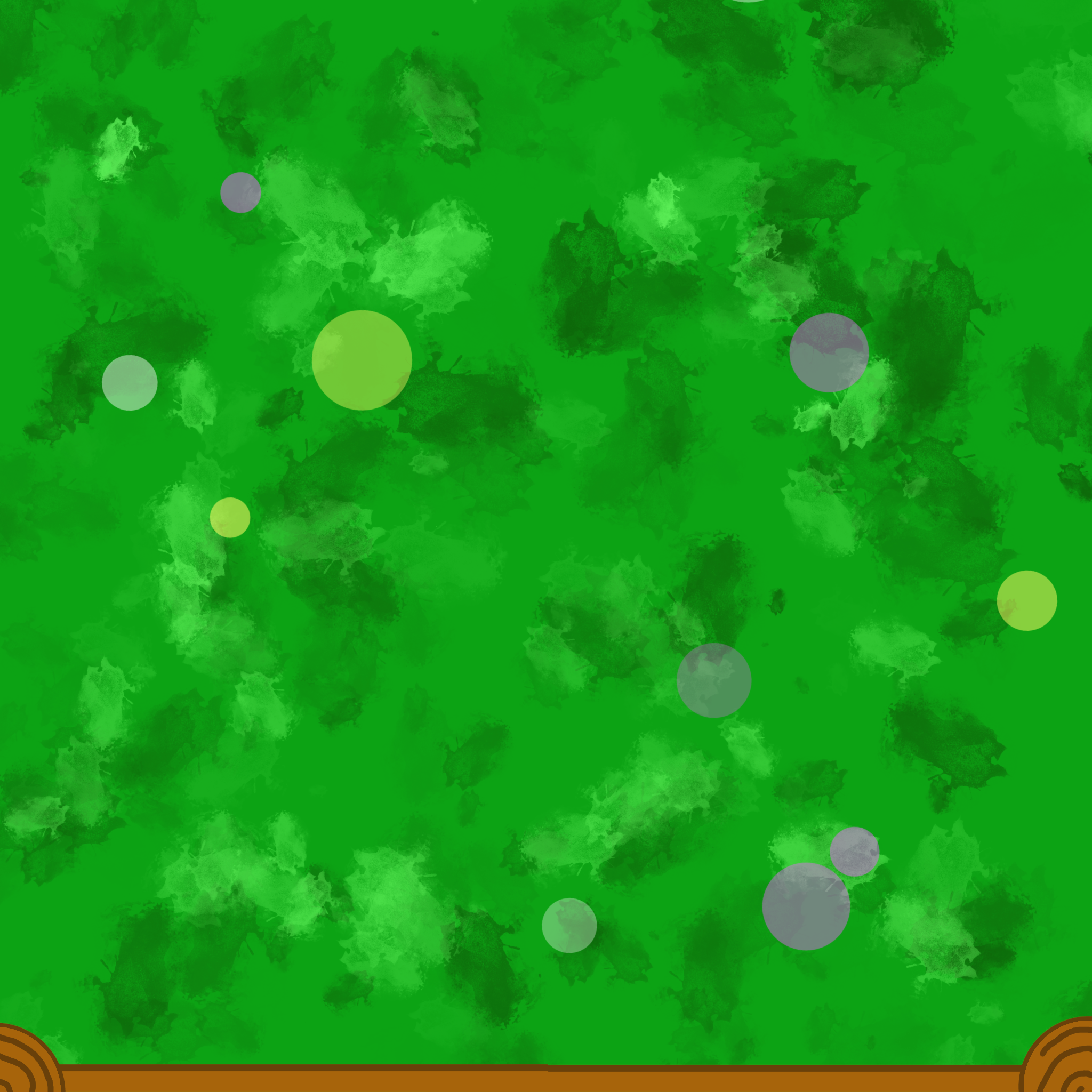
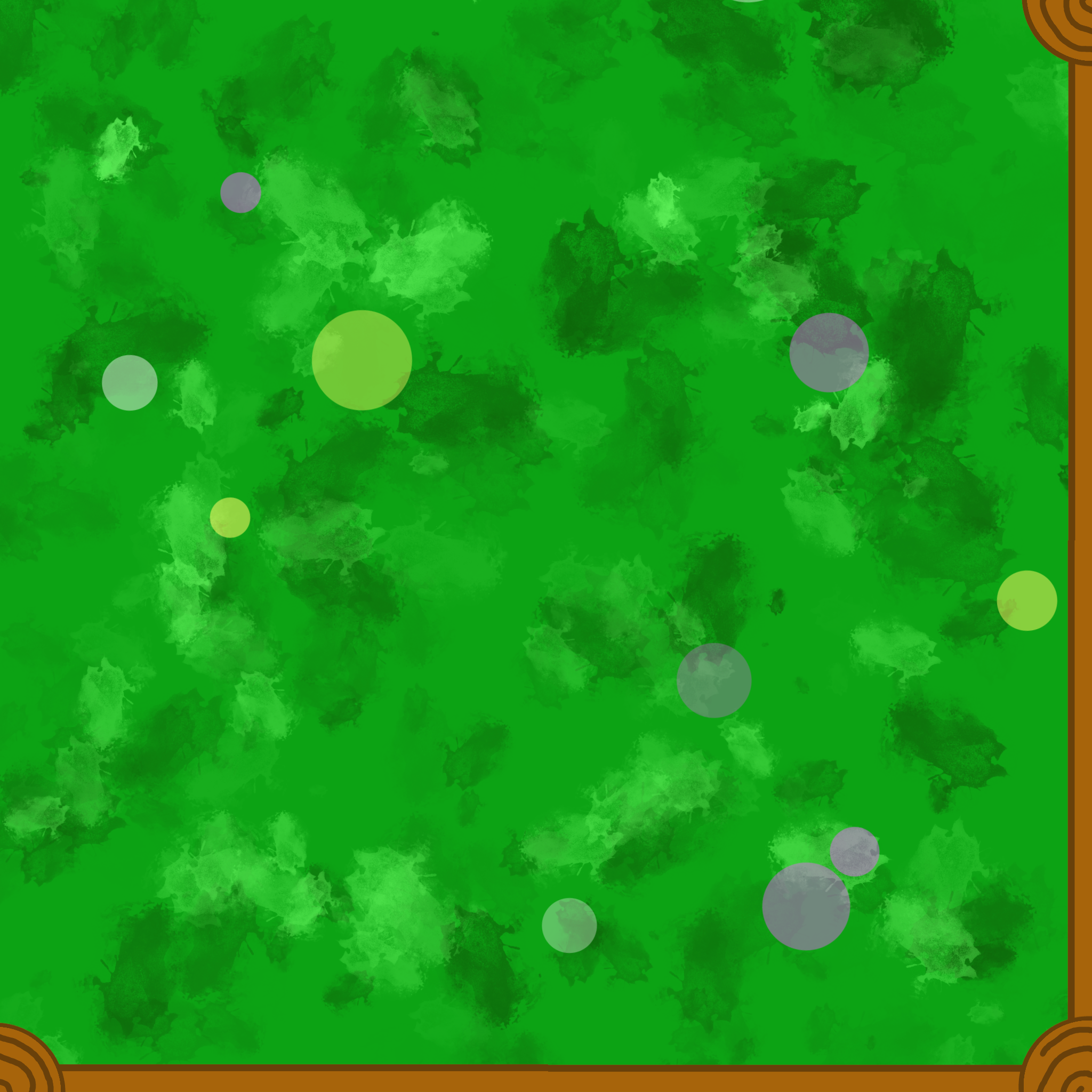
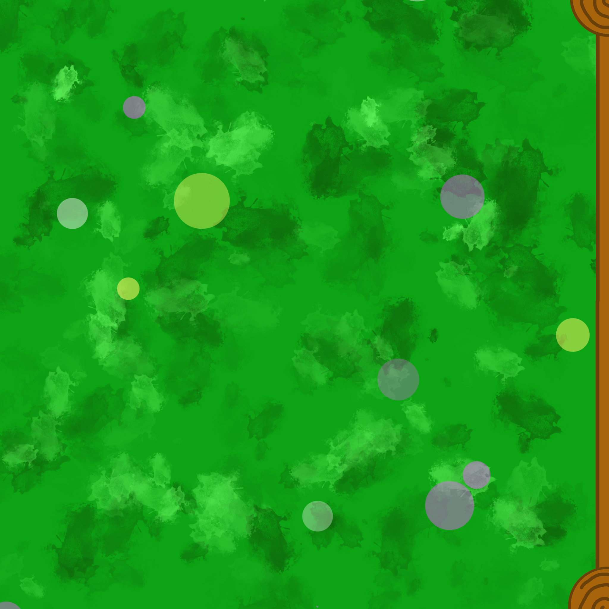
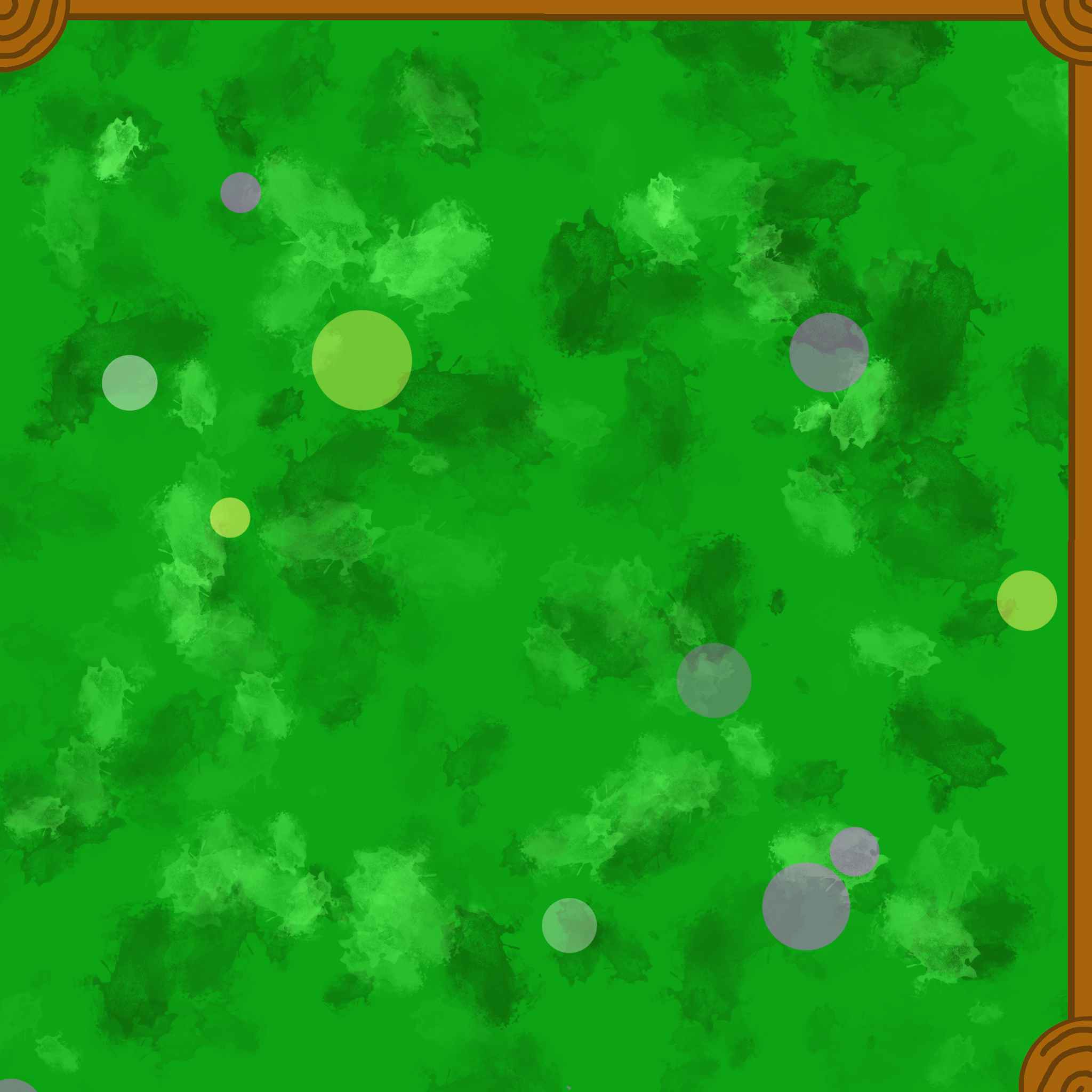
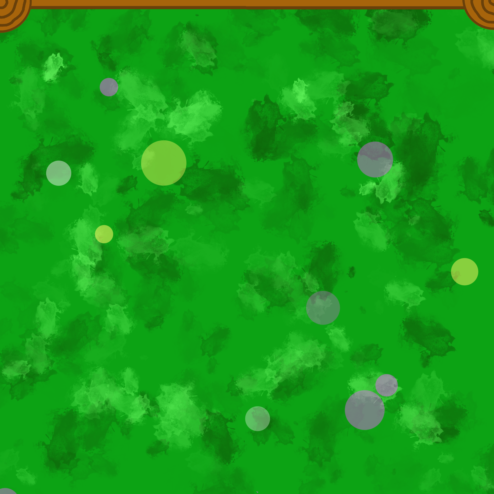
 The 'blank' meadow. I upped the 'scatter' for a couple of brushes and picked some different colours for a meadow-y feel
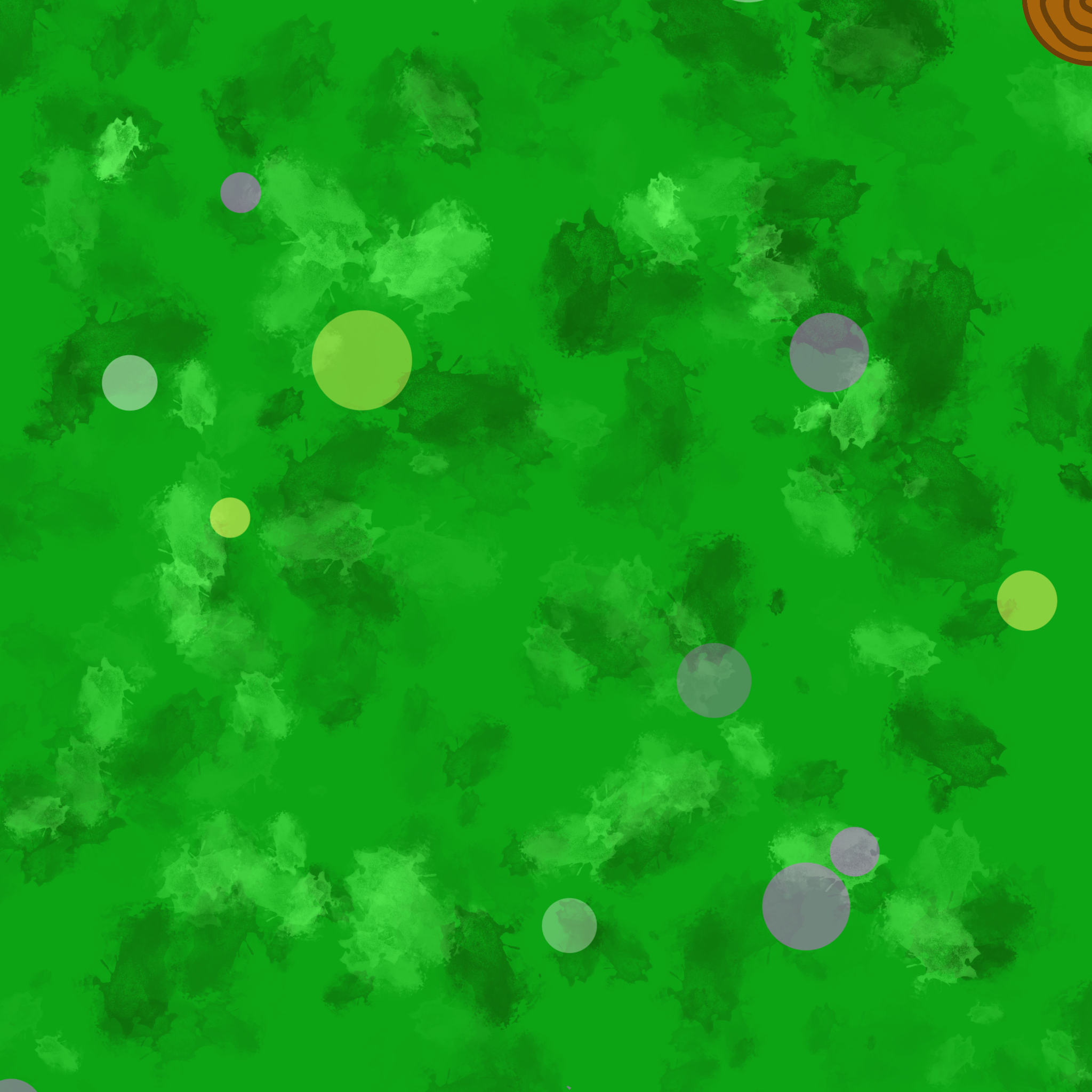
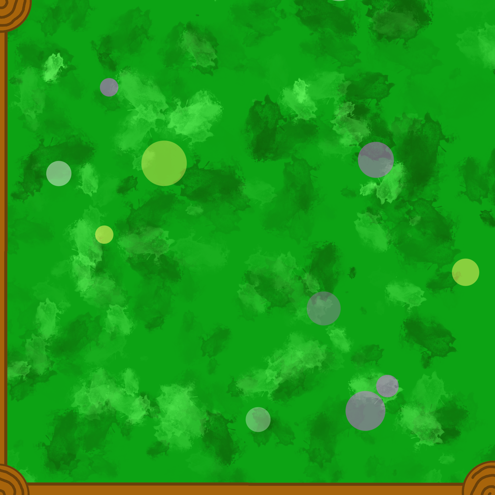
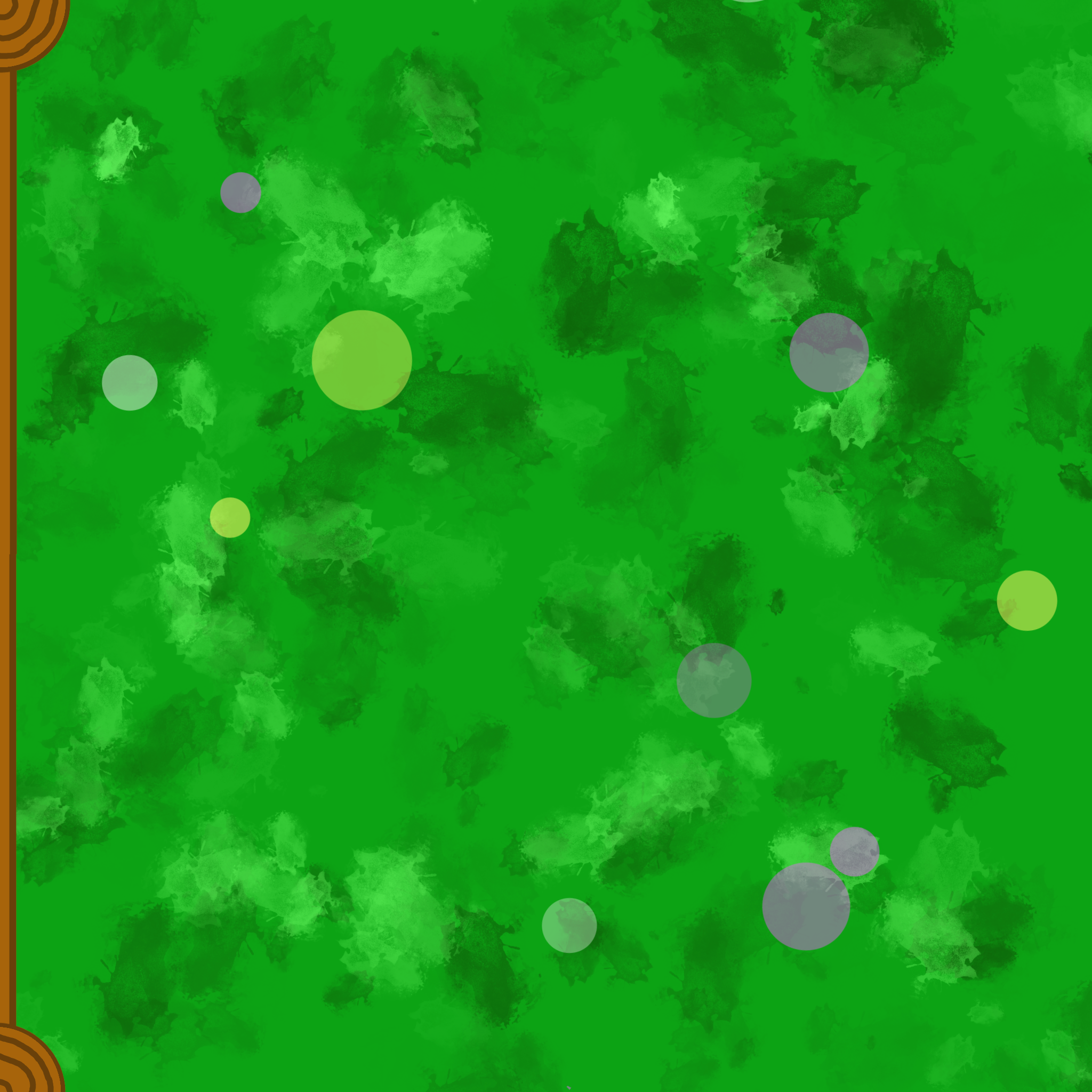
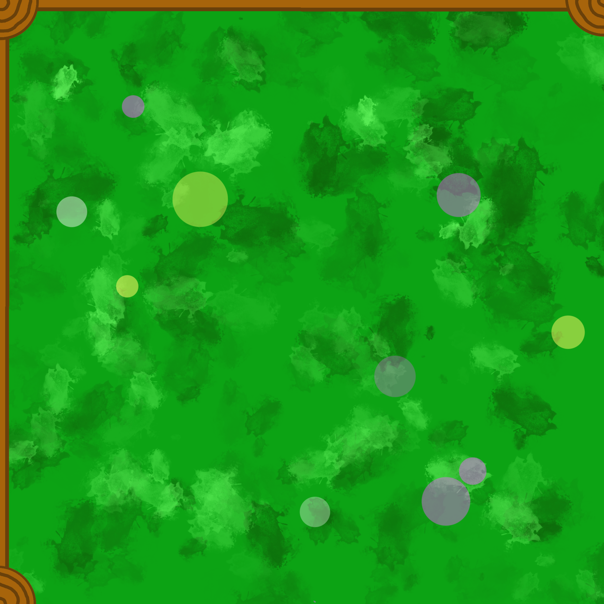
I took this into GIMP and did the border parts. The 'upright post' was on one layer that I duplicated and moved to the relevant corners. Then I put in the horizontal posts. Each on different layers. Each part of these tile pieces will be part of a larger mosaic of the game board.
Set 2: Ducks
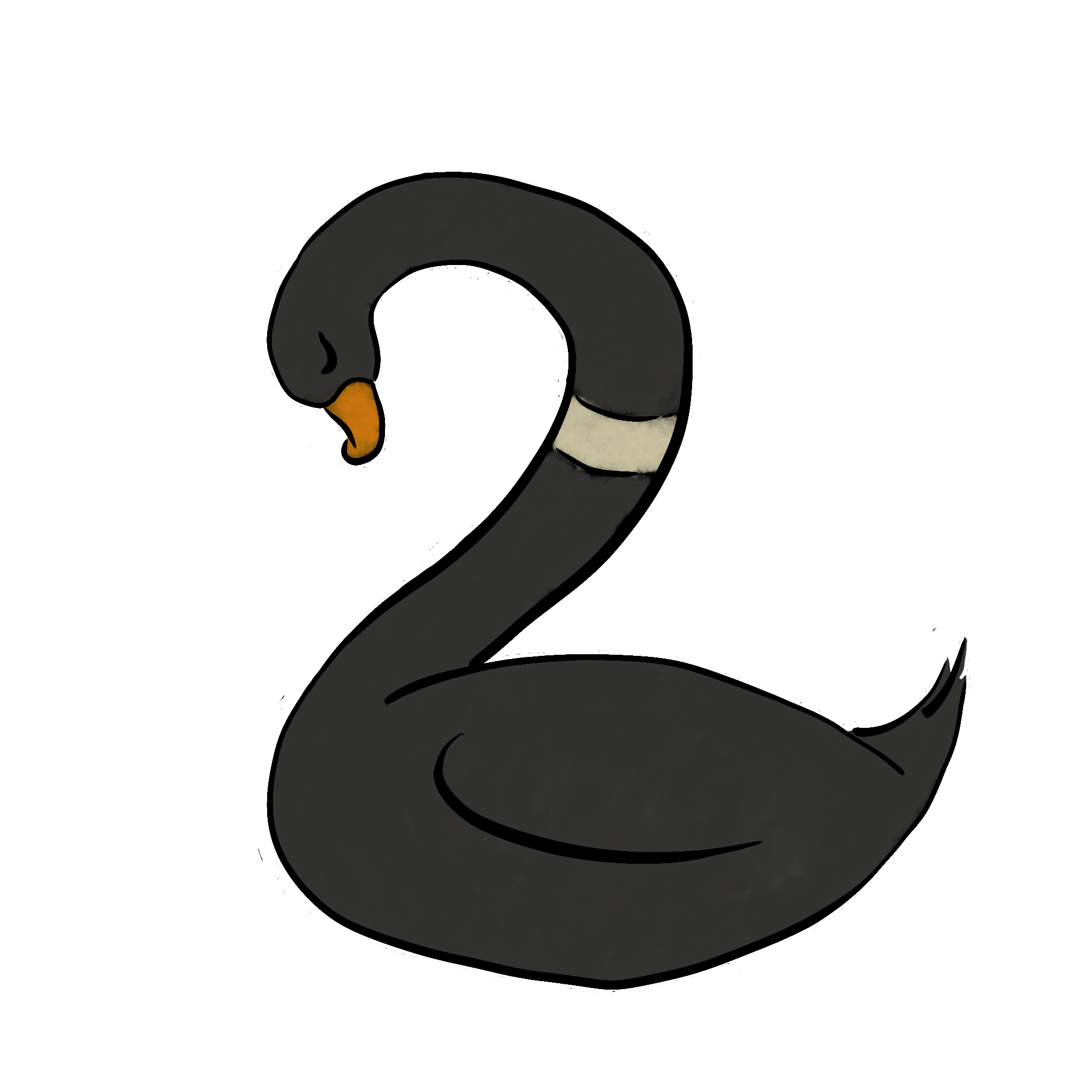
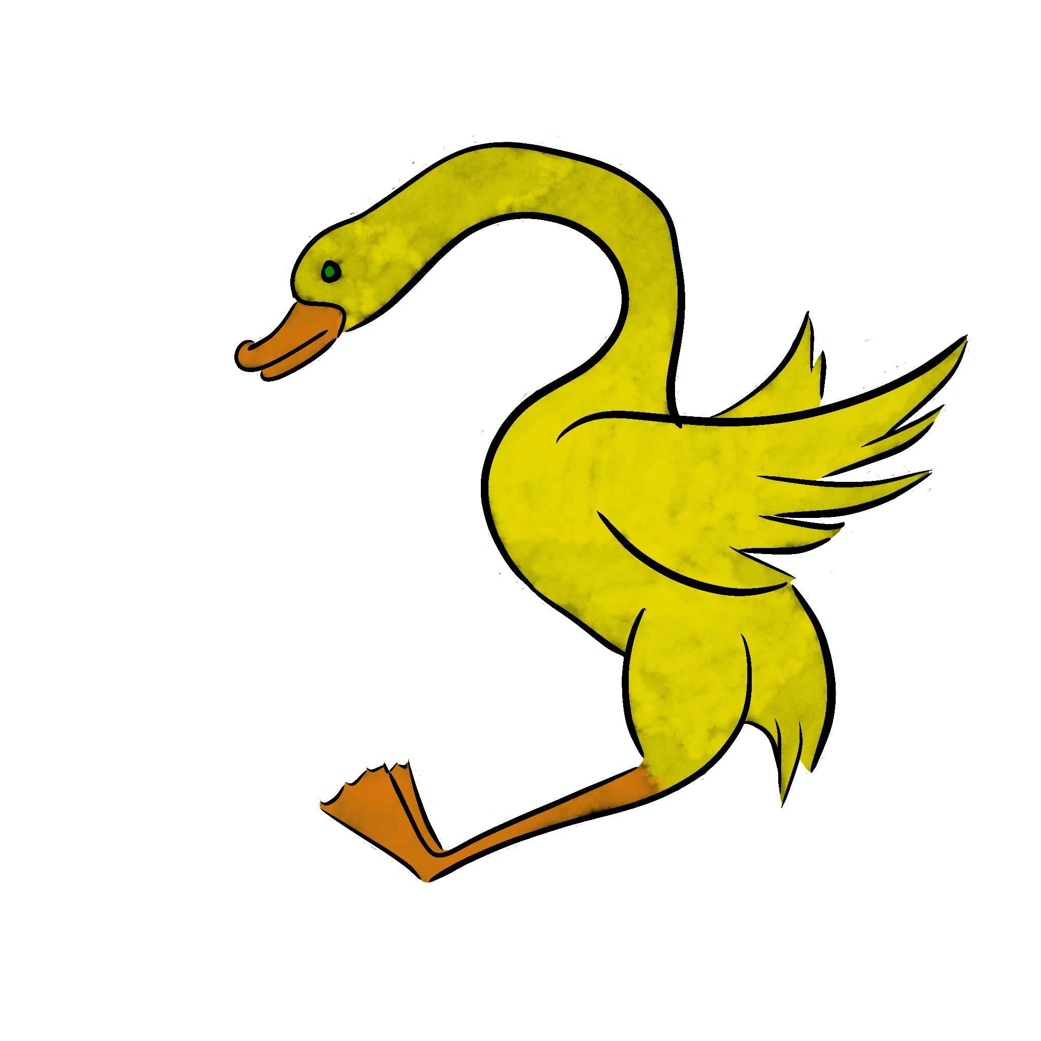
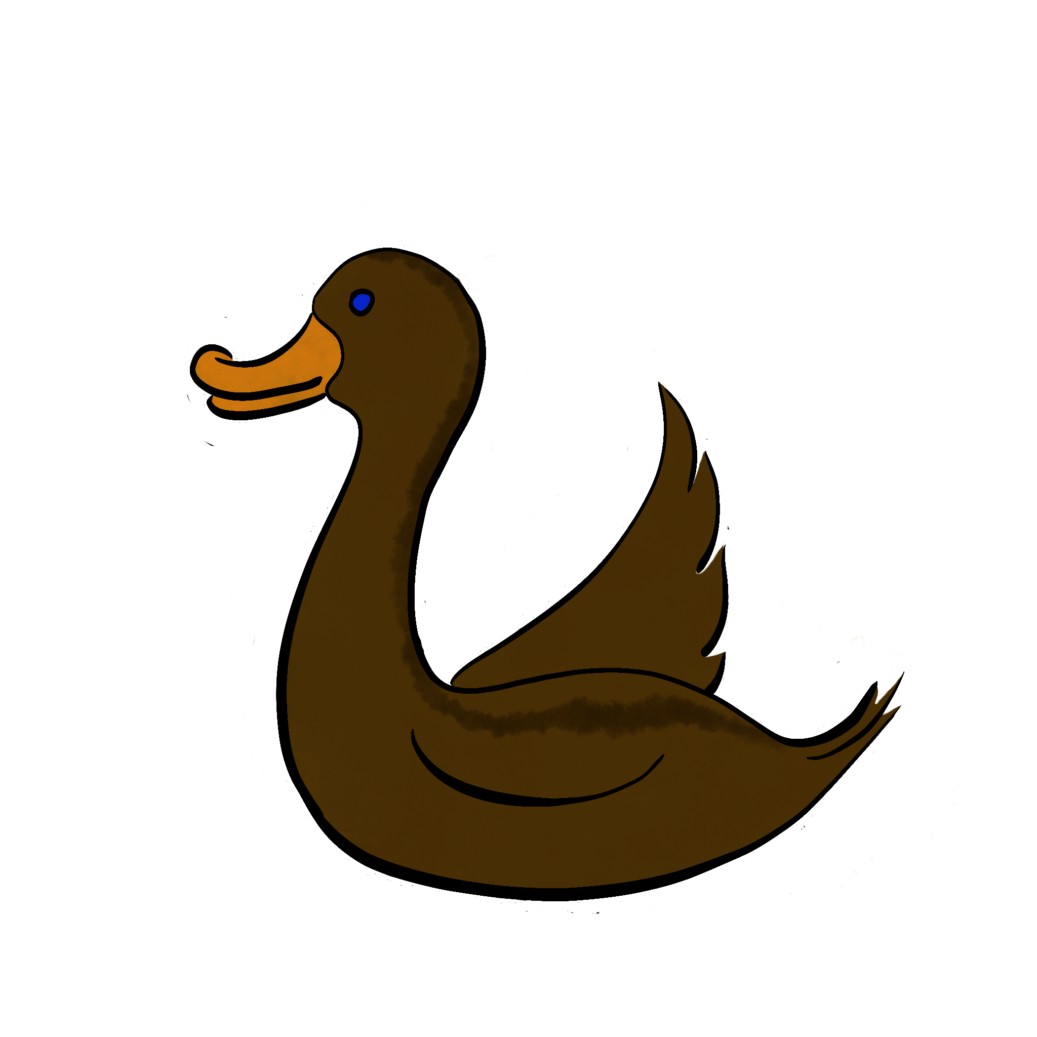
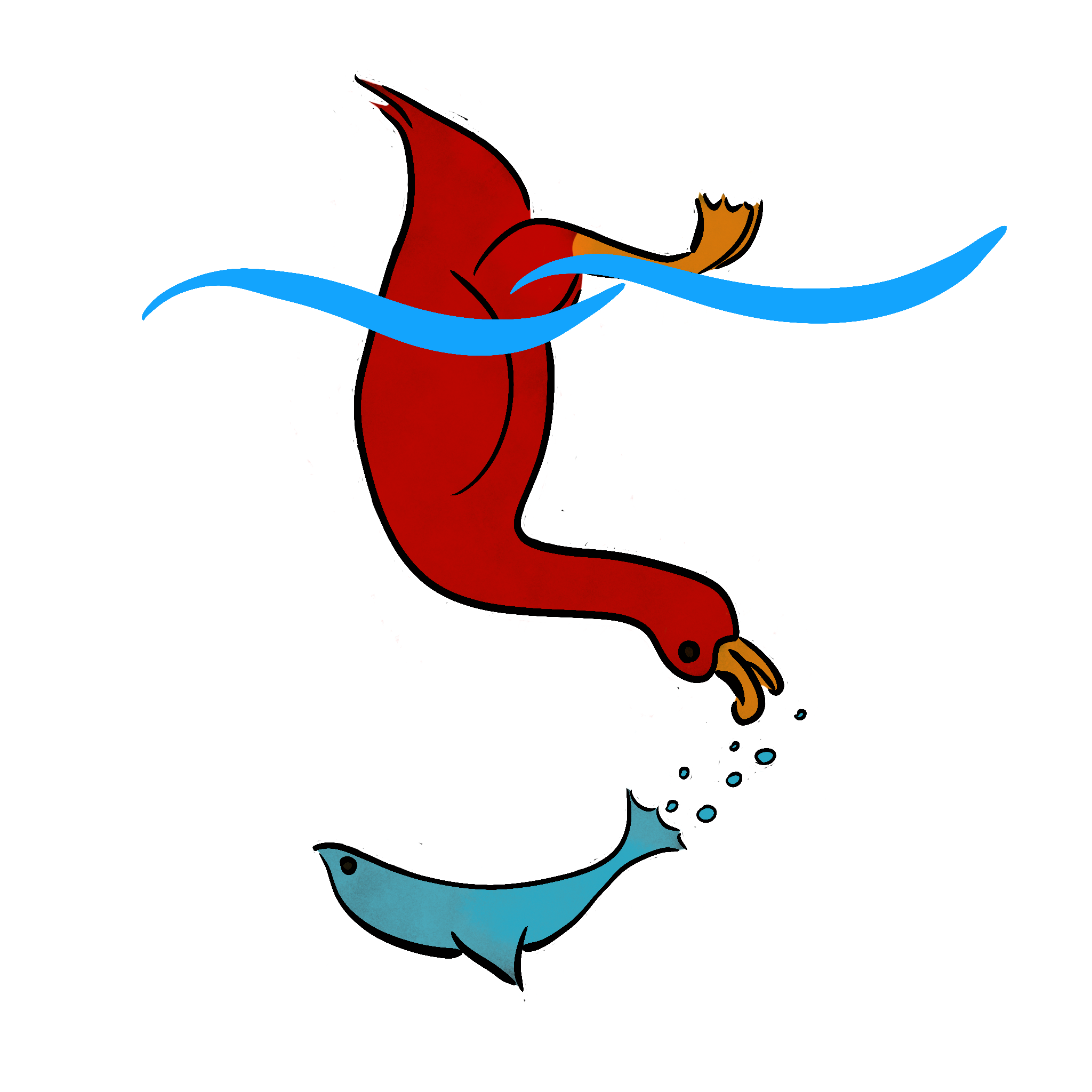
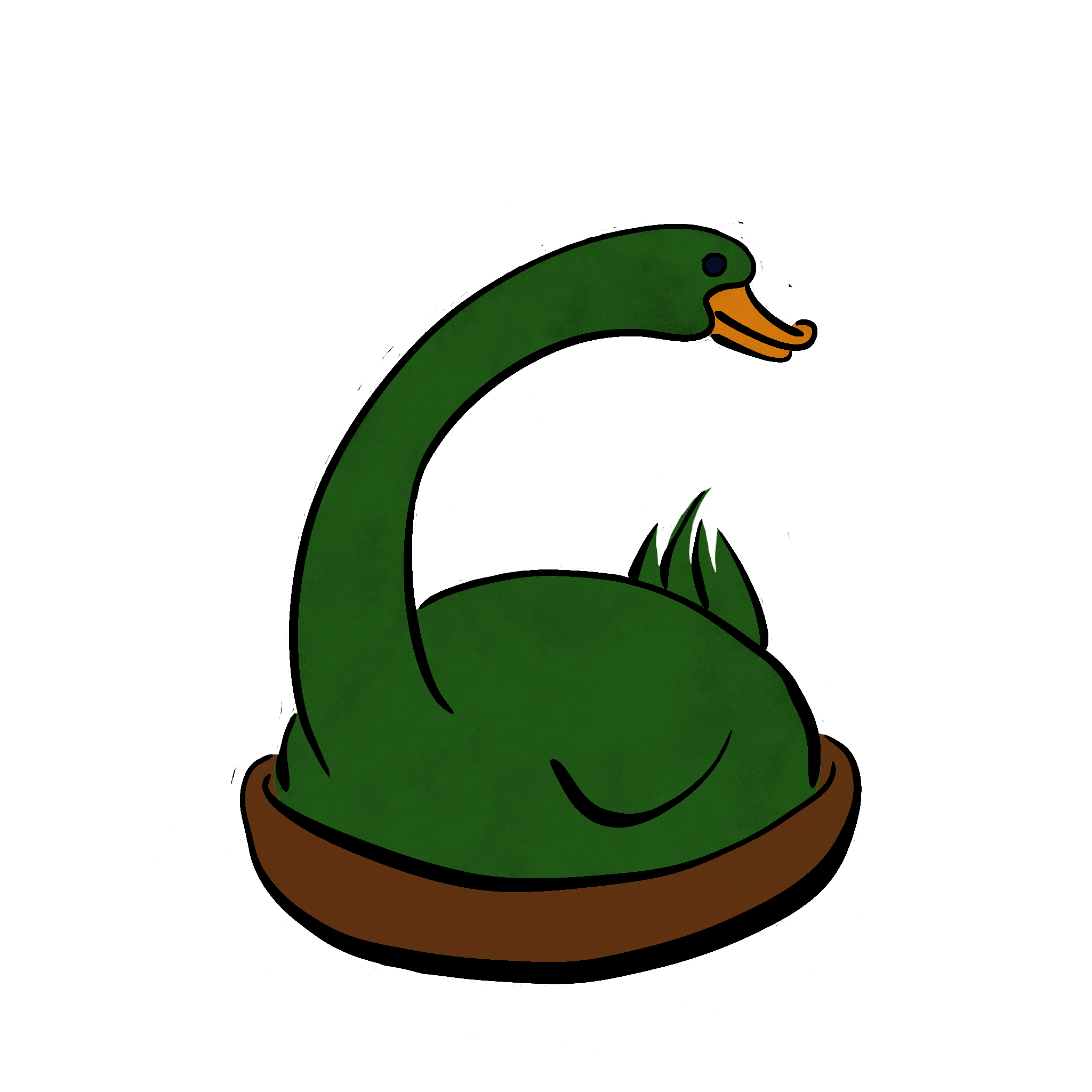
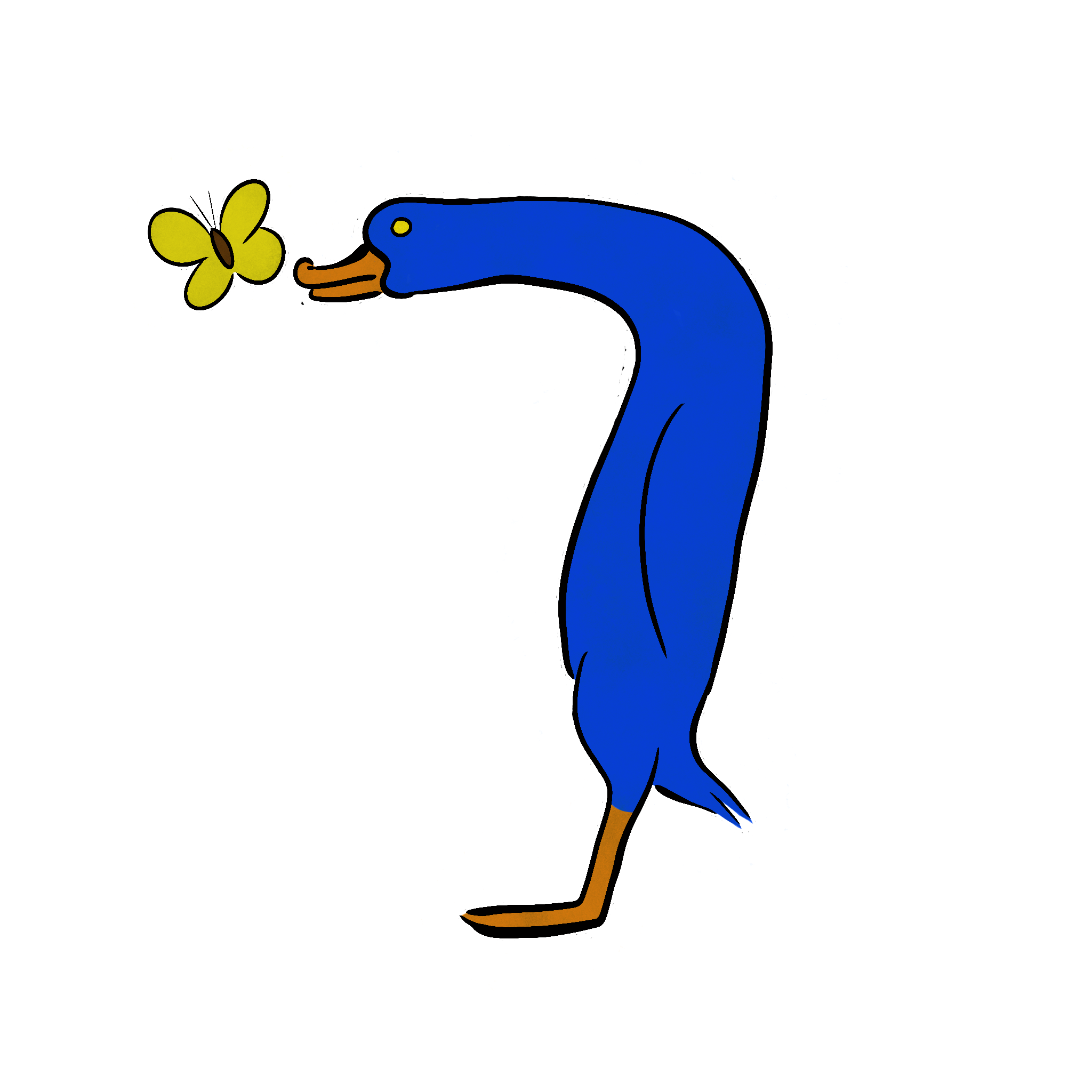
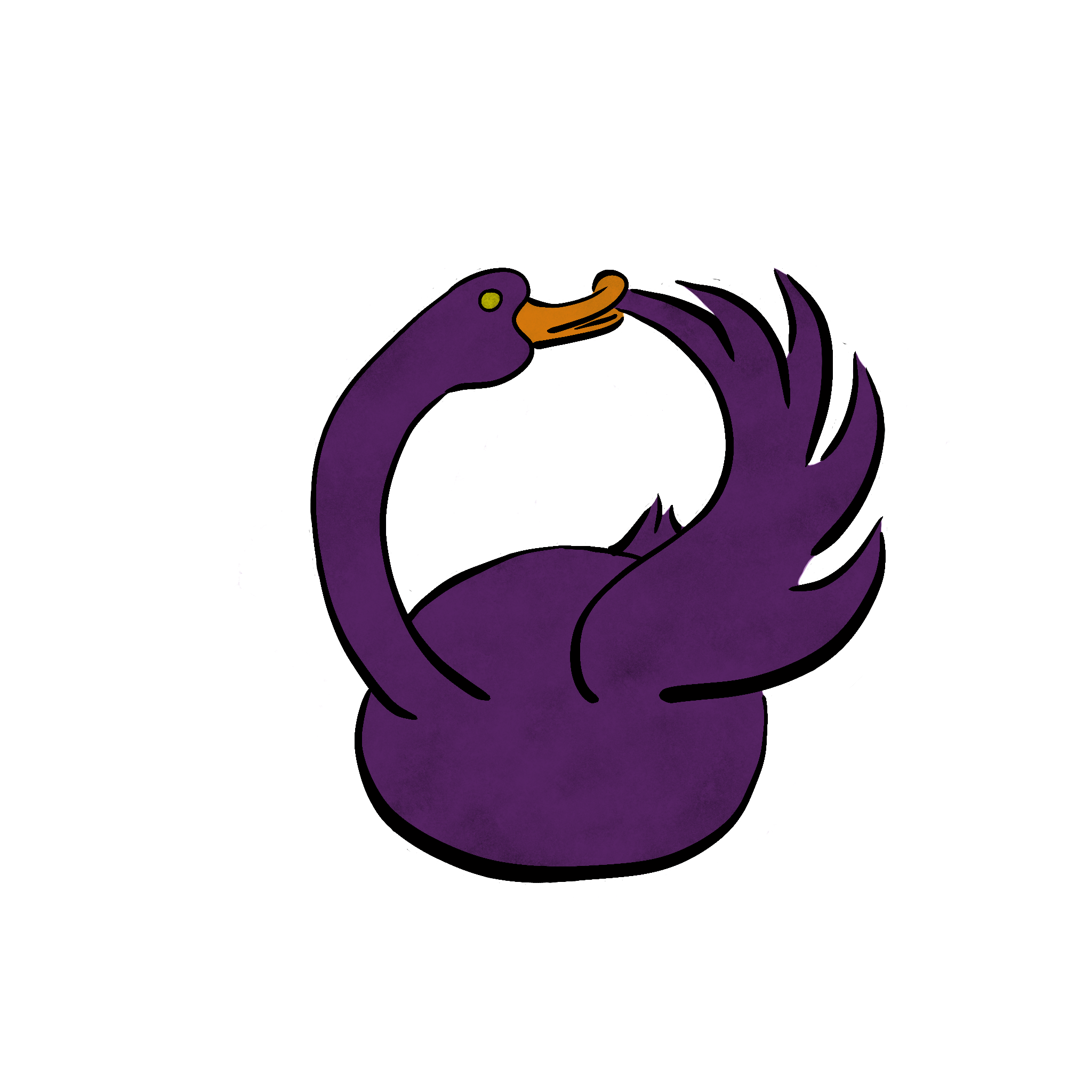
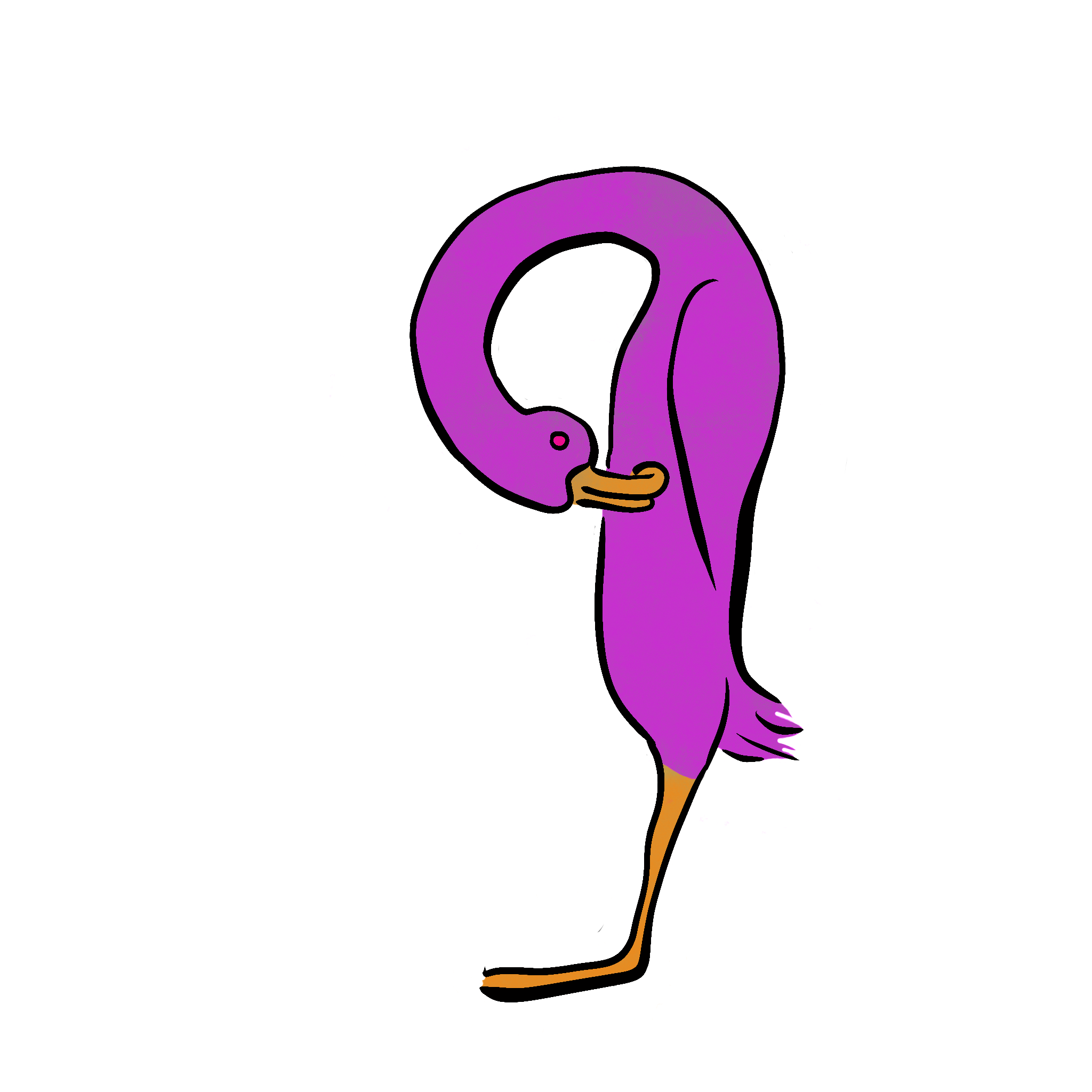
I'll eventually release a speedpaint video where you'll see every single one of my mistakes in making these. Beloved says the "dark ducks" look better, but I don't know about that now that they're transparent. I'll post 'light' and 'dark' versions of Una, aka Duck#1

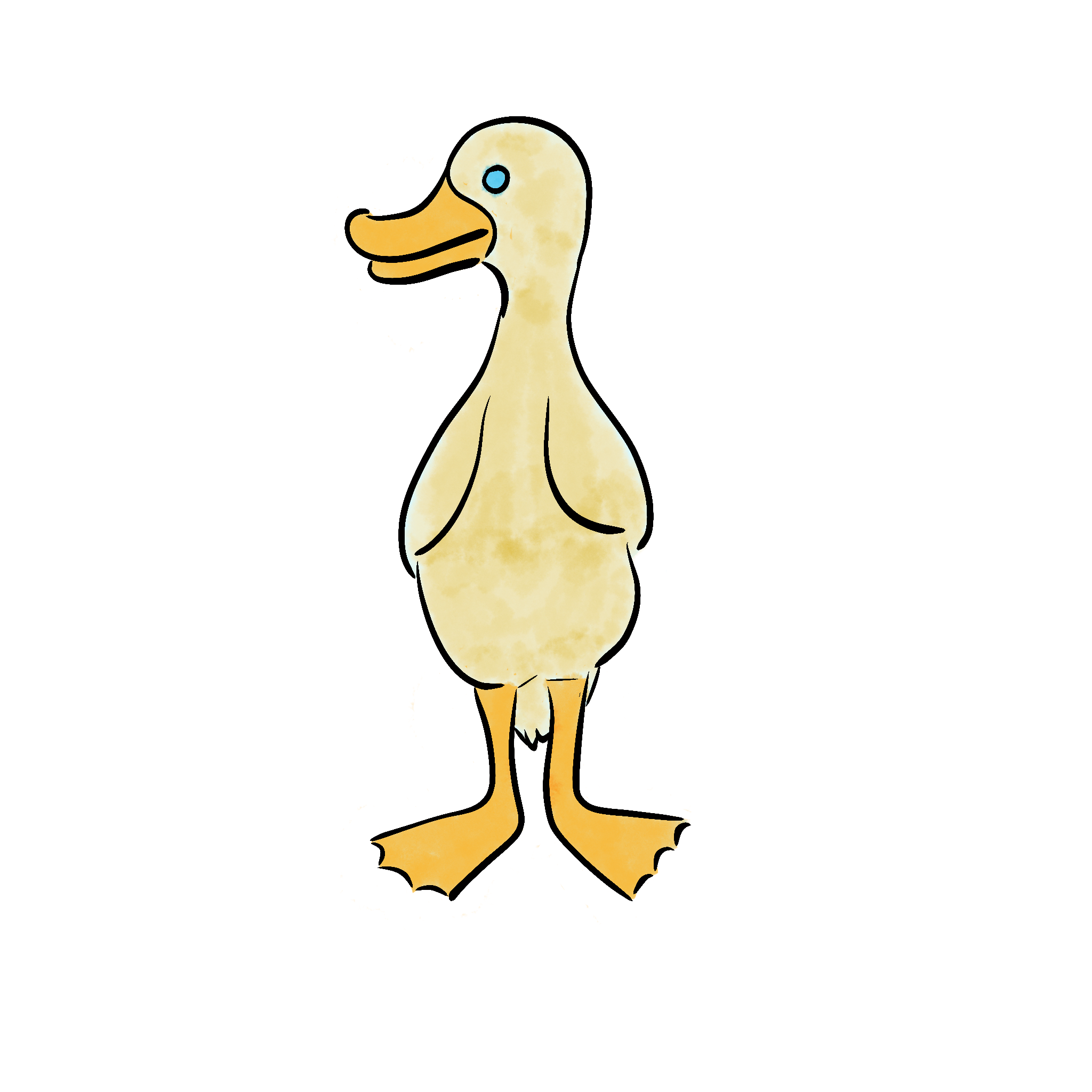
And now the rest of them (dark version)
Set 3: Buttons (Incomplete)
I haven't drawn all of them just yet. I have a couple more to go and I have to remember what I had in my mockups [I'm a bit silly]
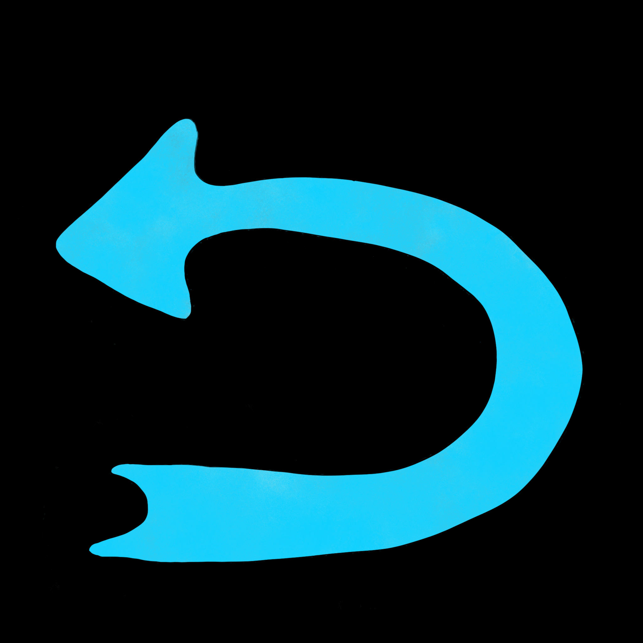 The Undo button that will be shown when there's nothing to undo. I did not make the other version transparent so I need to fix that.
 The Help button. This may or may not bring up a sub-menu offering the guide as to which bits do what, showing the "sight lines" of the birds, or offering a hint. Those options may also be extra buttons on the right hand side of the game screen.
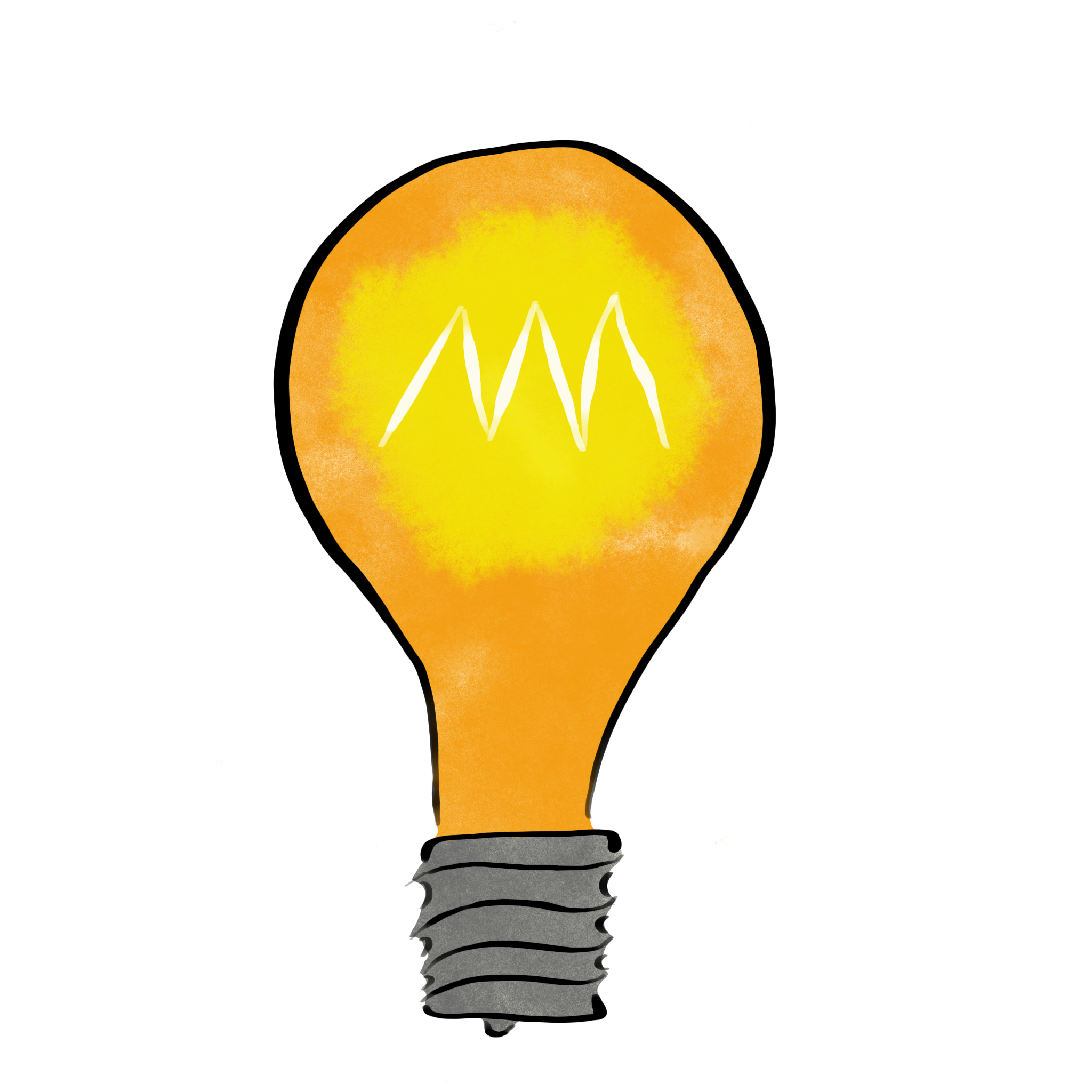 The Hint button. So many puzzle game GUIs have lightbulbs for the hint button so I leaned into that idea.
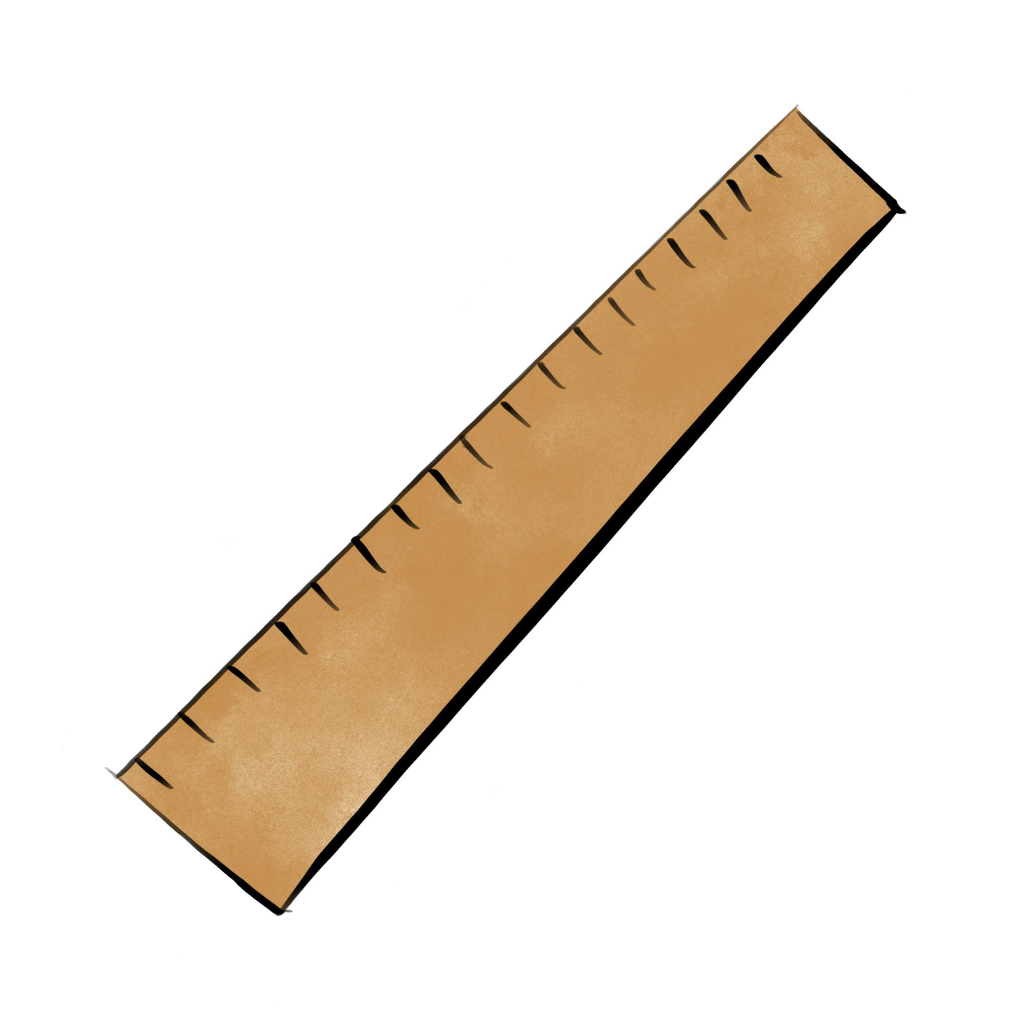 The Show Lines button. Since all the birds are colour-coded for convenience, the idea of a help to solve a puzzle is to draw coloured lines showing which lines and columns are no longer available for which birds.
 The Guide button. Using the iconography of Information booths everywhere. I chose the one with the fancier serifs to imitate.
 The Next button. I didn't bother with the "previous" button, as all I needed to do was flip it the other way around in GIMP. Which I did. You'll see it in later mockups.
 The Erase button. I made it look like every eraser from my childhood. Rumour had it that the grey side could erase ink, but all it ever did was tear the paper.
 And finally, the transparent Undo button. Players will be seeing a lot more of this one than the other variety.