Owing to three days of consecutive confusion, I must state the following:
THIS IS NOT AN INTERACTIVE EXERCISE
THIS EXISTS TO TEST THE AESTHETICS
In many Sudoku games, the numbers placed as part of the puzzle are visually different from the ones the user places into the puzzle. I want to know:
- Whether this is a good idea for the finished game
- If the birds on the left or the right side of the grid LOOK BETTER
- If either of them look like they were placed BY THE PROGRAM and NOT BY THE USER
- If the buttons for use look better closer to the grid or further away. Keep in mind that if they look better closer, they will move when the game progresses to the 9x9 grid.
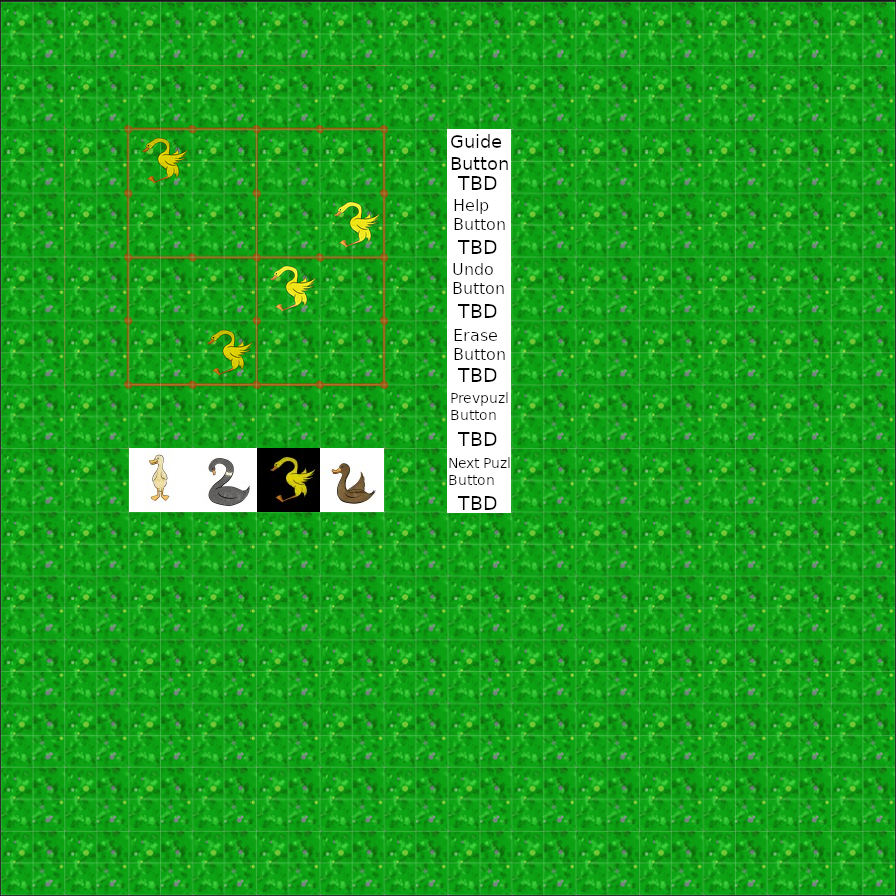 Shown here, the 4x4 grid mockup of the game screen, with unfinished MOCKUP BUTTONS to the right of the grid, and bird buttons underneath.
TBD stands for To Be Drawn. The birds on the LEFT HAND SIDE of the grid are darker than the ones on the RIGHT HAND SIDE. I can already see the ones on the right are brighter and 'pop' better.
The bird in position three is dark because all available birds have been placed in the grid.
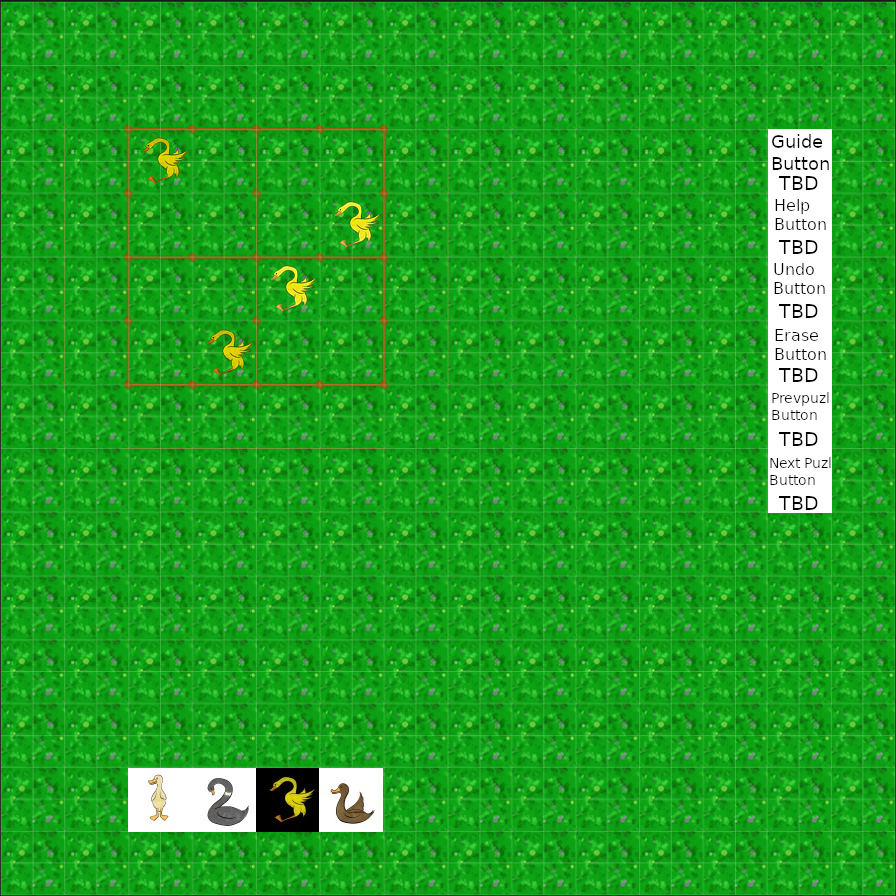 Shown here, the same 4x4 grid, but with the buttons where they would be through the entirety of the game.
Either placement would allow for text windows for the inevitable tutorial, but I want to know which placement of the buttons would be more "findable".