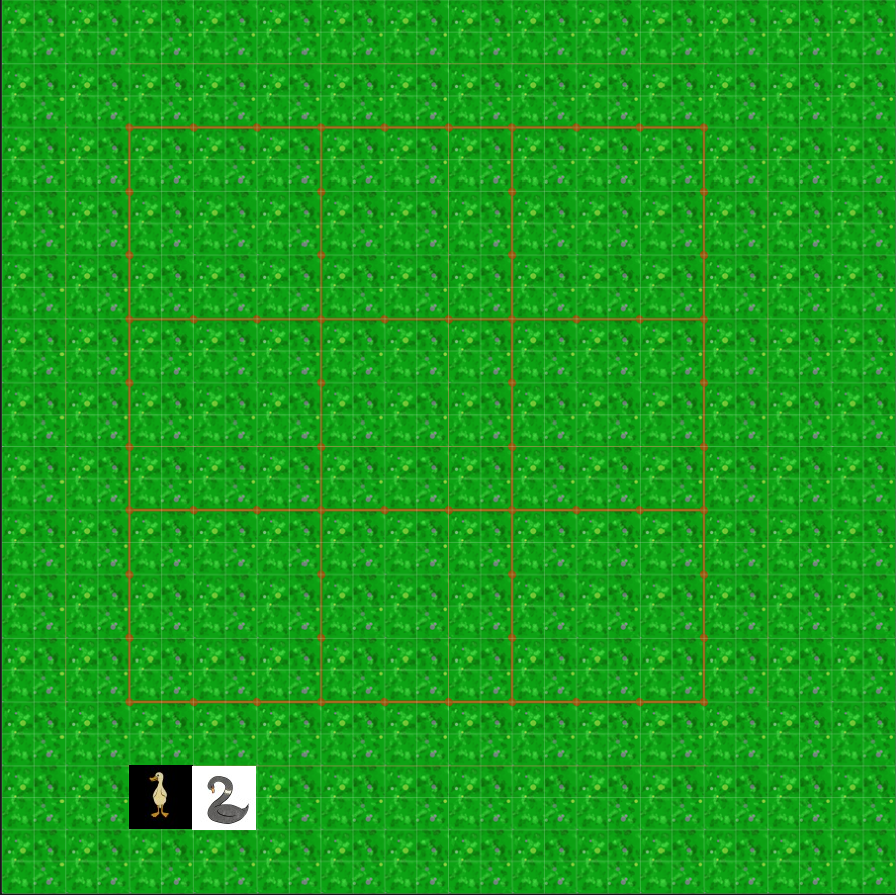
Okay. According to GameMaker, the field is 896 pixels square, and according to GIMP, I've got it right.
My idea is to have the "Duck Select" the one that's coloured in. The placed ducks on the game field will be "transparent" in that they will NOT be standing on a black or white field.
My question to my target audience [Hi, Mum!] is this:
Which duck looks like it's "full" - as in, you can pick more ducks up to place in the game field? Versus which duck looks "empty" - you have officially used all the ducks available in this button?
 [Shown here: the 9x9 game field featuring two duck buttons, one on a black field and the other on a white field]
Ironically, the white duck is on a black field and the black duck is on a white field. During gameplay, the player should click on a duck button to place a duck on the field.
NEXT mockup will be about which duck "reads" clearer on the game field. And I'll be asking about the 4x4 game field's placement of buttons.